Tip: Are you a non-native English speaker? I have just finished creating a
  Web App
Last year, I published a map showing the current state of immigration in Europe. However, I realized that the data contained in the 2015 UN study could also be analysed the other way around—rather than the numbers and most common countries of origin of immigrants, it is possible to create a map showing the numbers of emigrants and the most common destinations of emigrants.
And this is exactly what this article is about. The following map shows the number of people who emigrated from a given country, as a percentage of its current population (or, more precisely, population in 2015). Let me clarify this with an example: The population of Poland in 2015 was approximately 38,612,000, according to the UN, and the number of people born in Poland who lived in a different country was 4,450,000, hence the figure 4,450,000/38,612,000 ≈ 11.5%:
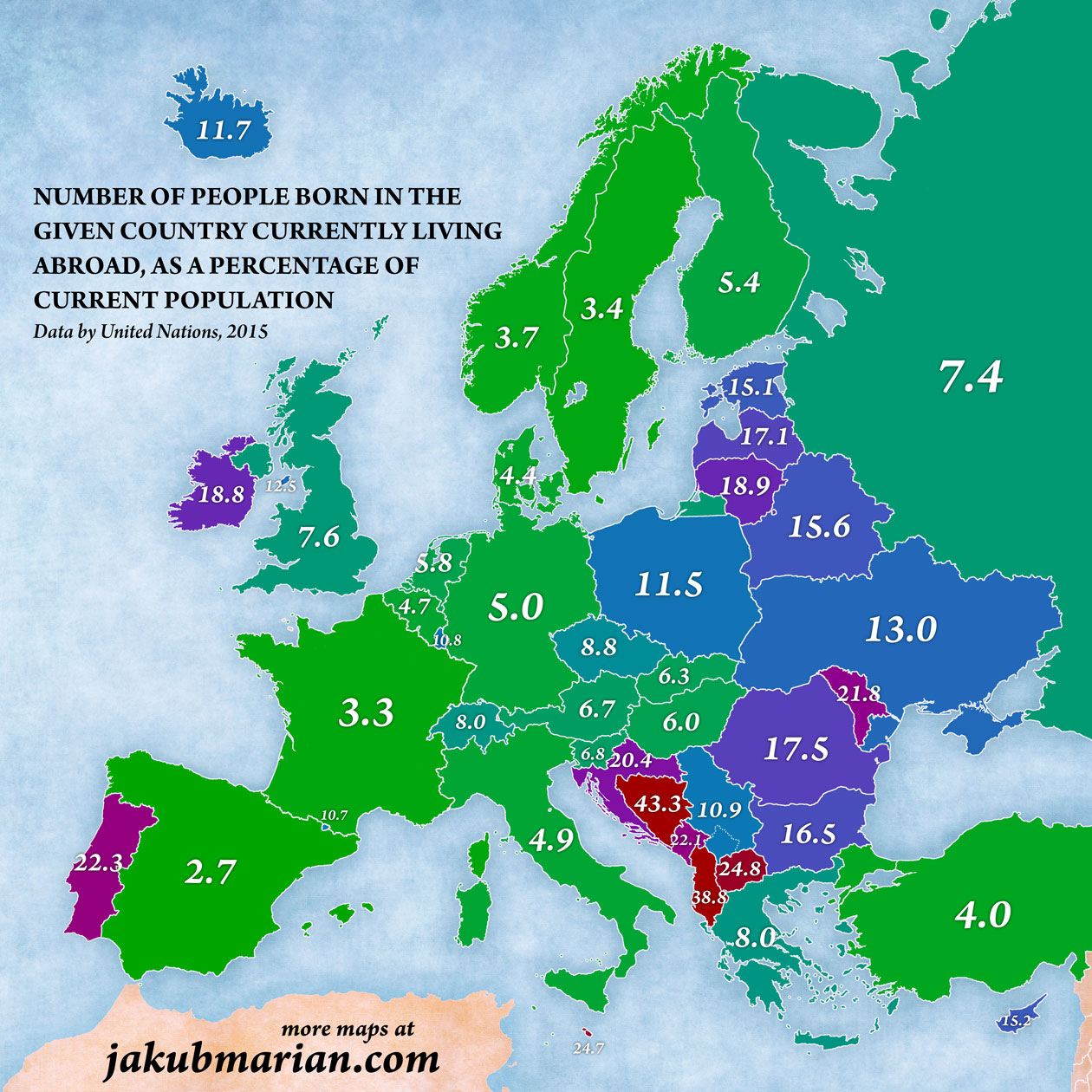
For comparison: The corresponding figure for the United States is just 0.9%. Although high percentages are shown in red in the map, high numbers are not necessarily bad per se (if emigration is counteracted by high birth rate or immigration, as in the case of Ireland and Portugal). However, most “blue” and “red” countries in the map have been losing population for several decades.
It is also worth noting that the UN data are based on the place of birth, not citizenship or ethnicity. This means, for example, that a German citizen born to a German family living in Poland who later moved from Poland to Germany would count as an emigrant from Poland, even though he or she has never been a Polish citizen.
With that in mind, take a look at the following map, which shows the most common destination of emigrants, that is, the country that hosts the largest immigrant population from each given country:
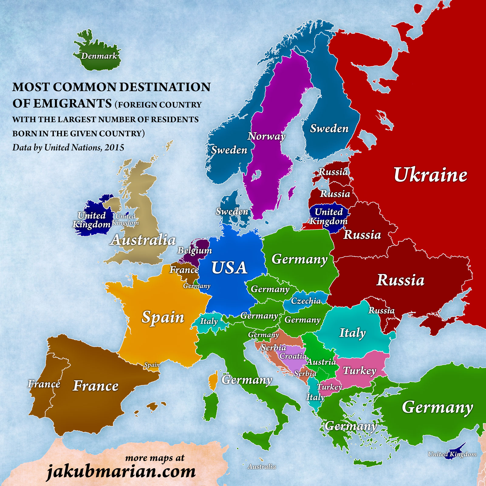
Some results may seem rather surprising. Russia is probably not the destination of choice of ethnic Estonians and Latvians; however, both countries have historically had large Russian minorities, which increased in size significantly during the Soviet era and started to shrink afterwards, so the trend we see in the map is mainly the result of ethnic Russians moving “back” to Russia rather than ethnic Estonians and Latvians emigrating. If emigrants to Russia are excluded, Estonians emigrate mostly to Finland and Latvians mostly to the United Kingdom.
Similarly, most emigrants from Bulgaria and Macedonia to Turkey are ethnic Turks. If emigrants to Turkey are excluded, most Bulgarians emigrate to Spain, and most Macedonians emigrate (rather surprisingly) to Switzerland.
Finally, the pattern seen in Russia, Ukraine, and Belarus is quite expected considering they used to be one nation with a highly mixed population until 1990. If we exclude all post-Soviet states, Russians emigrate mostly to Germany and Ukrainians and Belarusians to the United states.