Tip: Are you a non-native English speaker? I have just finished creating a
  Web App
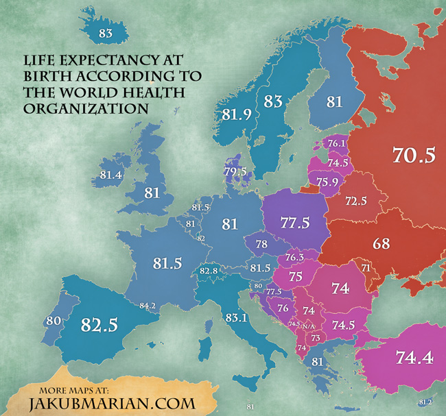
Life expectancy at birth is defined as the number of years a newly born individual in the given country is expected to live on average, based on known mortality rates. There are various factors influencing life expectancy, such as quality of health care, dietary customs, public safety, wealth, and many others. The following map is based on a report by the World Health Organization from 2012.
Quite surprisingly, there are huge differences even within Europe. The difference between the highest scoring nation (Andorra, 84.2 years) and the lowest scoring nation (Ukraine, 68 years) is over 16 whole years, or about 24% more. Since the data were gathered before the conflict in Ukraine, the current figure for Ukraine is probably even lower.
Do you like the map? Show your support by sharing it.Sharing with attribution helps me create more maps.