Tip: Are you a non-native English speaker? I have just finished creating a
  Web App
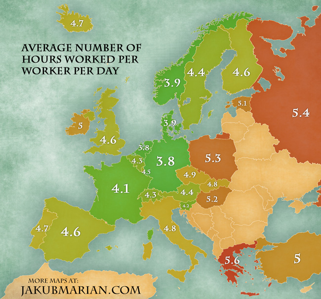
The following map shows the number of hours an average worker in the given country works each day (not just on working days), on average. It is based on data by OECD for the year 2013.
The number is defined as the total number of hours worked in the year 2013 in the given country divided by the number of people who worked in the given year (which is what the OECD table shows) and then divided by 365. Both full-time and part-time workers are included!
The figures should be taken with a grain of salt because OECD had to adjust the data for various components which may not have been included in the original statistical reports of each country, such as hours lost due to illness, maternity leave, overtime, etc., and such estimates will never be completely accurate.