Tip: Are you a non-native English speaker? I have just finished creating a
  Web App
The following map shows the number of hours workers in each country work per week, on average, including both full-time and part-time workers. It based on the following table by OECD (2016).
Here’s the methodology used: The total number of hours worked in the year 2016 in each country is divided by the number of people who worked during that year (which is what the OECD table shows) and then it is divided by 52.14 (the number of weeks in a typical year). The result is then rounded.
The quantity shown in the map is unusual in that it is not immediately clear whether higher or lower numbers are better. However, since the number of hours worked is negatively correlated with other economic indicators that are generally considered positive, such as GDP per capita, I decided to show low numbers in green and high numbers in red:
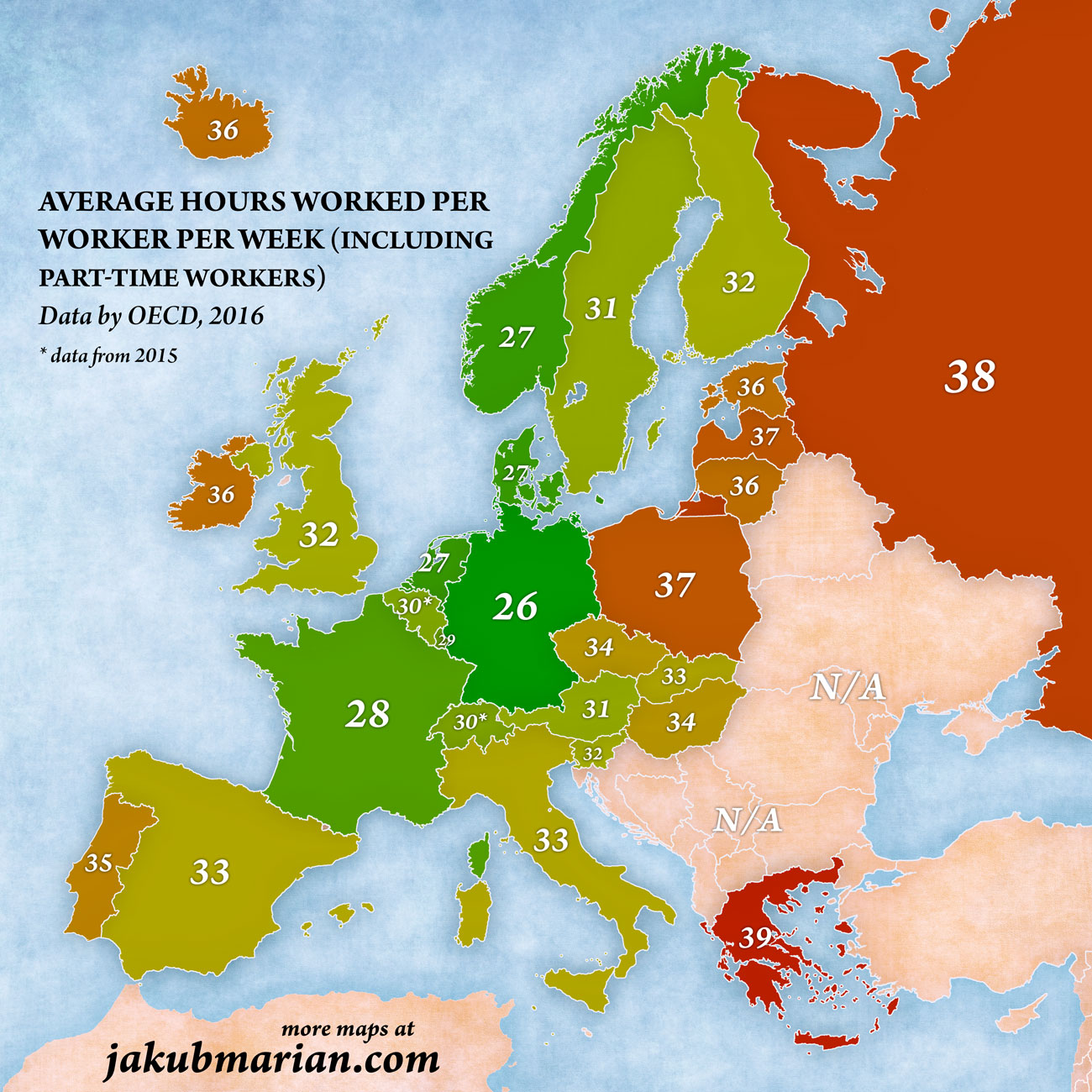
For comparison, other OECD members scored as follows (with the same methodology): Canada 33, Japan 33, United States 34, New Zealand 34, Israel 36, Chile 38, Korea 40, Mexico 43.
Please note that the values for the following countries are, according to the OECD website, just estimates based on surveys, not actual reported accounting data:
Partly estimated: Portugal, Austria, Estonia, Greece, Slovakia, Slovenia
This means that those values are less suitable for comparison than the rest.