Tip: Are you a non-native English speaker? I have just finished creating a
  Web App
People say that a picture is worth a thousand words, so let’s take a look at the two colours in comparison (there are various shades of purple and violet, and the following picture shows some of the more common ones):

So, purple is more reddish and saturated, while violet is more bluish and less saturated. Case closed, right?
There is more in it than the eyes can see (quite literally). To understand the difference, we have to take a look at how our eyes work first. The electromagnetic spectrum is a continuous range of wavelengths, only a tiny part of which is visible to humans:
We see neither the ultraviolet wavelengths and shorter, nor the infrared wavelengths and longer. How do we see the rest? We have three types of colour-sensitive cells in our eyes, so-called cones. The cones don’t perceive just a single wavelength; they are activated by a whole range of wavelengths, and the signals received from the cones are then processed by the brain in such a way that every colour can be thought of as composed of three different elementary signals.
The following picture shows approximately how the brain perceives different spectral colours (the higher the curve, the higher the intensity of the elementary signal the brain receives):
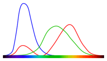
Note that this chart does not show the spectral properties of the cones themselves (but they look similar). It represents the CIE 1931 colour space, which, simply put, corresponds to the signals after they have been processed by the brain.
For example, when you see monochromatic (pure) red light on the very right side of the spectrum, only the “red” signal path is activated, which tells your brain to create the impression of red. On the other hand, when you see pure green light (in the middle), both “green” and “red” paths are activated, but your brain knows that “a lot of green activation and a bit less red activation” is in fact just a pure green colour, which is what you see.
When a mixture of photons that have different wavelengths hits the retina (creating a ratio of red, green, and blue activation different from any spectral colour), the brain will perceive it as an entirely different colour. For example, there is no white wavelength. What we perceive as “white” is in fact just a mixture of many different spectral colours.
What happens when violet light hits the retina?
The “red” signal path has an interesting additional property. As you can see above, it has a small bump of activation around the short-wavelength (violet) end of the visible spectrum. When violet light hits the retina, both the “blue” path and (much less) the “red” path are activated. The brain interprets this kind of input in a specific way, which we call “violet”.
It is worth noting that the pigment in the “green” cones themselves also has a small peak of absorption around violet wavelengths, but the brain seems to ignore it (it is not possible to simulate the perception of violet by a combination of green and blue light).
Purple is not a spectral colour
As we noted before, many colours we can see are not in the visible spectrum. When you see an object, typically a mixture of different wavelengths reaches your retina, which causes the cones to be activated at a ratio not achievable by a spectral colour.
Our brains are very good at interpreting this mixture (it would be silly to simply throw away a part of the incoming information and make everything look like the closest spectral colour), and, as a result, we are able to see several million different colours, most of which are not present in the spectrum.
As we noted at the beginning of the article, purple looks more “reddish” than violet, and that’s absolutely correct. Purple is formed by mixing red and blue in a ratio close to 1:1, whereas violet is perceived by your eyes as containing more blue than red.
However, as you can see from the picture above, no spectral colour activates the “blue” path and the “red” path at the ratio of 1:1 without also stimulating the “green” path. In other words purple is not a spectral colour. You can have a source of monochromatic violet light (i.e. a source producing just a single wavelength), but everything that looks purple must emit both red and blue light.
Purple and violet look similar only to humans
To us, humans, purple looks like a more saturated shade of violet, but violet objects in nature are fundamentally different from purple ones. Purple objects are “red and blue at the same time”, whereas violet objects are… just violet.
If you take a look at the distance between violet and blue in the picture of the spectrum above, it is about the same as the distance between green and orange. Purple is a mixture of red (which is at the opposite side of the spectrum than violet) and blue (which is relatively far from violet), so it is, in terms of wavelengths, a completely different colour.
The reason why purple and violet look similar to us is because they stimulate our cones in a similar way, but most other animals don’t share the same types of cones and “post-processing”. This means that to other animals, purple and violet may look completely different!
Now imagine a violet flower petal with a purple pattern on it. Depending on the particular shades, this pattern might be completely invisible to us, while many other animals could see it as clearly as we can see an orange pattern on green background. Even common consumer cameras wouldn’t help us; they are designed to capture the same red-green-blue information as our eyes do, so even taking a photo of the petal and editing it in Photoshop would not uncover the pattern. Quite fascinating, isn’t it?