Tip: Are you a non-native English speaker? I have just finished creating a
  Web App
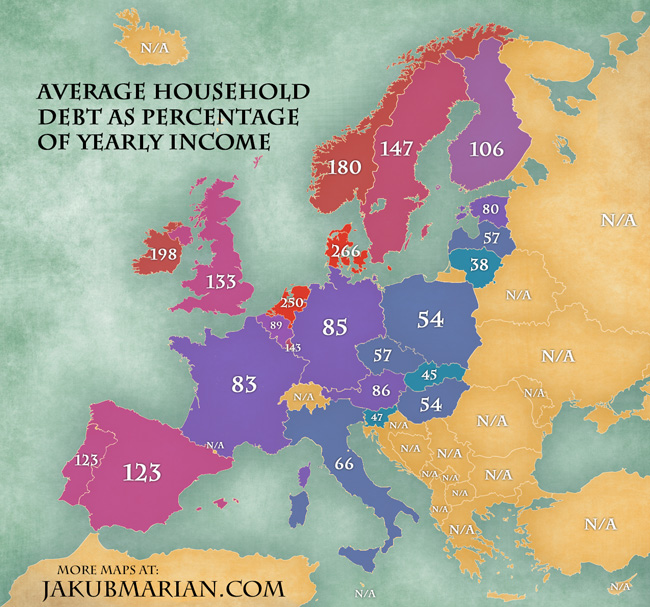
There is a worrying tendency among households in European countries to spend more than they can afford. The following map shows the average size of a household’s debt (in terms of loans, mortgages, negative credit card balances, etc.) as a percentage of the household’s yearly income. It is based on data (2012) by Eurostat (which, unfortunately, doesn’t include all European countries)
It should be noted, however, that not all debts are created equal. There is a huge difference between long-term investments and consumer loans; for example, every person with a mortgage adds a lot to the figures in the map, but, in the end, he or she will not only repay the loan, but also own a new house or flat, whereas a person getting a loan only to spend it, for instance, on food, will posses no additional property after repaying the loan, so higher figures do not necessarily imply something is wrong.