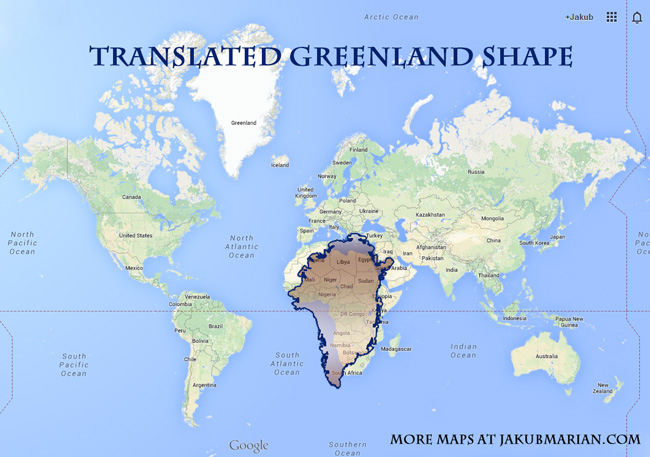
We are all used to seeing the following kind of maps in Google Maps and other map providers (this one, in particular, is taken from Google Maps). Were you ever wondering how huge Greenland was? If we just take the shape of Greenland and put it over Africa, it looks like a huge desert of snow:

So, is Greenland really so big? The problem is that (unlike some of us believe) the Earth has a spherical shape. In order to display a spherical surface on a computer screen, it has to be deformed (unless you have a spherical computer screen).
There are several ways you can project a sphere onto a flat screen, each having its advantages and disadvantages. Google Maps uses (something close to) the Mercator projection (imagine wrapping a cylinder around the Earth which touches it at the Equator and drawing the map slice by slice).
This projection has some nice properties; it is conformal, which means that all angles on your flat screen look the same as on the original sphere. However, this is done at the cost of distorting areas: The further from the Equator we look, the bigger everything appears to be.
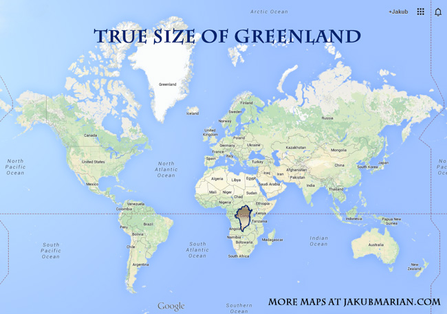
This is especially true for Greenland because of its very northern latitude. To see how big it really is, I’ve taken the shape of Greenland from the map above and resized it to its proper size:

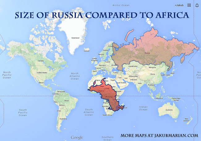
Not that impressive anymore, is it? Something similar happens with Russia. Would you believe that Africa is almost twice as large as Russia (in terms of area)? When we scale down the shape of Russia, deform it to a shape truer to its real spherical shape and put it over Africa, we get:

 Tip: Are you a non-native English speaker? I have just finished creating a
  Web App
