Tip: Are you a non-native English speaker? I have just finished creating a
  Web App
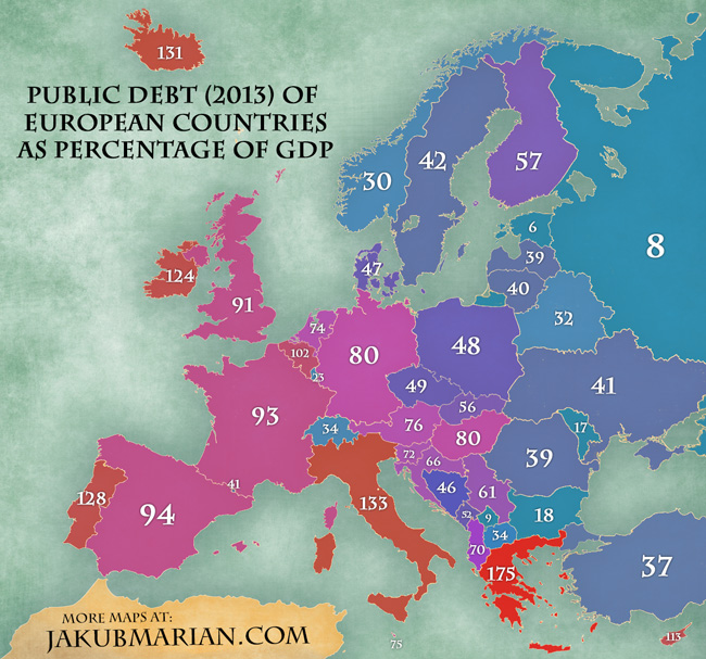
There seems to be an interesting trend in geographic distribution of public debt in Europe. While Western Europe is traditionally considered to be richer than Eastern Europe, the following map makes us question to what degree this is caused by western countries being more likely to borrow more than they can repay. (Note: the map is based on the CIA World Factbook 2013.)
The underlying blank map is due to Tindo and licensed from fotolia.com. If you want to share the maps, please share a link to this webpage instead of sharing just isolated pictures.
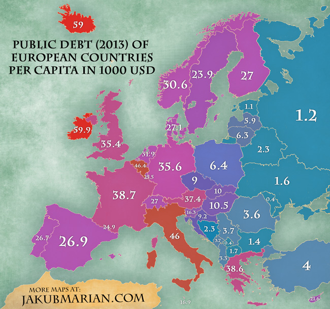
Another interesting piece of information is the debt size per capita. The following map shows how much each inhabitant of a country would have to pay (in thousands USD) should the country decide to repay the debt by directly collecting money from its citizens.
The figures were computed using the GDP of each country and the percentages shown above (both from the CIA World Factbook, 2013) to get the public debt in USD and dividing the result by population size (based on data by The World Bank).