Tip: Are you a non-native English speaker? I have just finished creating a
  Web App
I have previously written about immigration and emigration in Europe. Of course, emigration effectively cancels out the effect of immigration on population size, so the discussion would not be complete without showing the total effect of migration on population size.
The following map shows the difference between the number of (currently living) immigrants to a country and emigrants from that country, as a percentage of the country’s population in 2015. It is based on a 2015 study by the United Nations.
However, the UN report does not take recent developments (in 2015 and 2016) in the so-called European migrant crisis into account. To make the map more up-to-date, I used the official Eurostat data on the number of asylum applicants between January 2015 and June 2016 (minus the number of rejected applicants) and added a secondary figure (marked with an asterisk) into the map, consisting of the UN data + the Eurostat data (for the most affected countries):
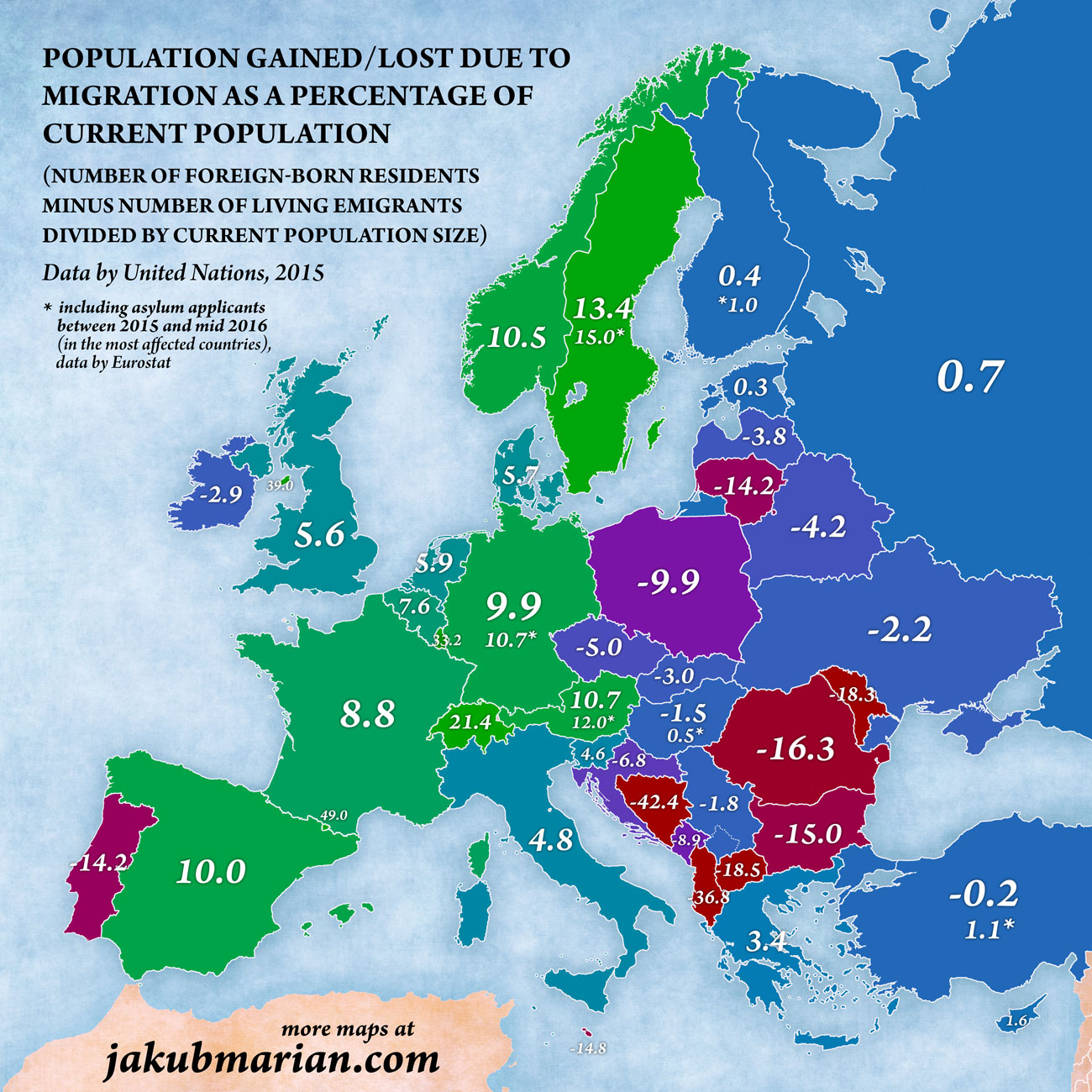
To interpret the map correctly, it is important to understand what foreign-born and emigrant mean within the context of this study. A person is said to be foreign-born if they reside in a certain country but were not born within the current borders of that country. For example, a person living in Portugal born in Portuguese Angola before it became a sovereign nation would still count as a foreign-born individual, since he or she was not born within the borders of modern-day Portugal, even if that person had Portuguese citizenship since birth.
What is perhaps even more interesting is the information where the migrants go (and where they come from). This is what the following map shows. To explain the colouring scheme: Yellow arrows indicate migration within Europe, blue arrows indicate Europeans migrating to a destination outside Europe, and orange arrows indicate non-Europeans (people born outside Europe) migrating to Europe. Arrows from and to Turkey were assigned both colours to represent the fact that a part of Turkey is located in Europe.
Please note that only migration patterns of more than 0.25 million people are shown. I also experimented with including arrows for 0.1 million people and more, but the map ended up being a chaotic mess of arrows. For the sake of clarity, I decided to show less information.
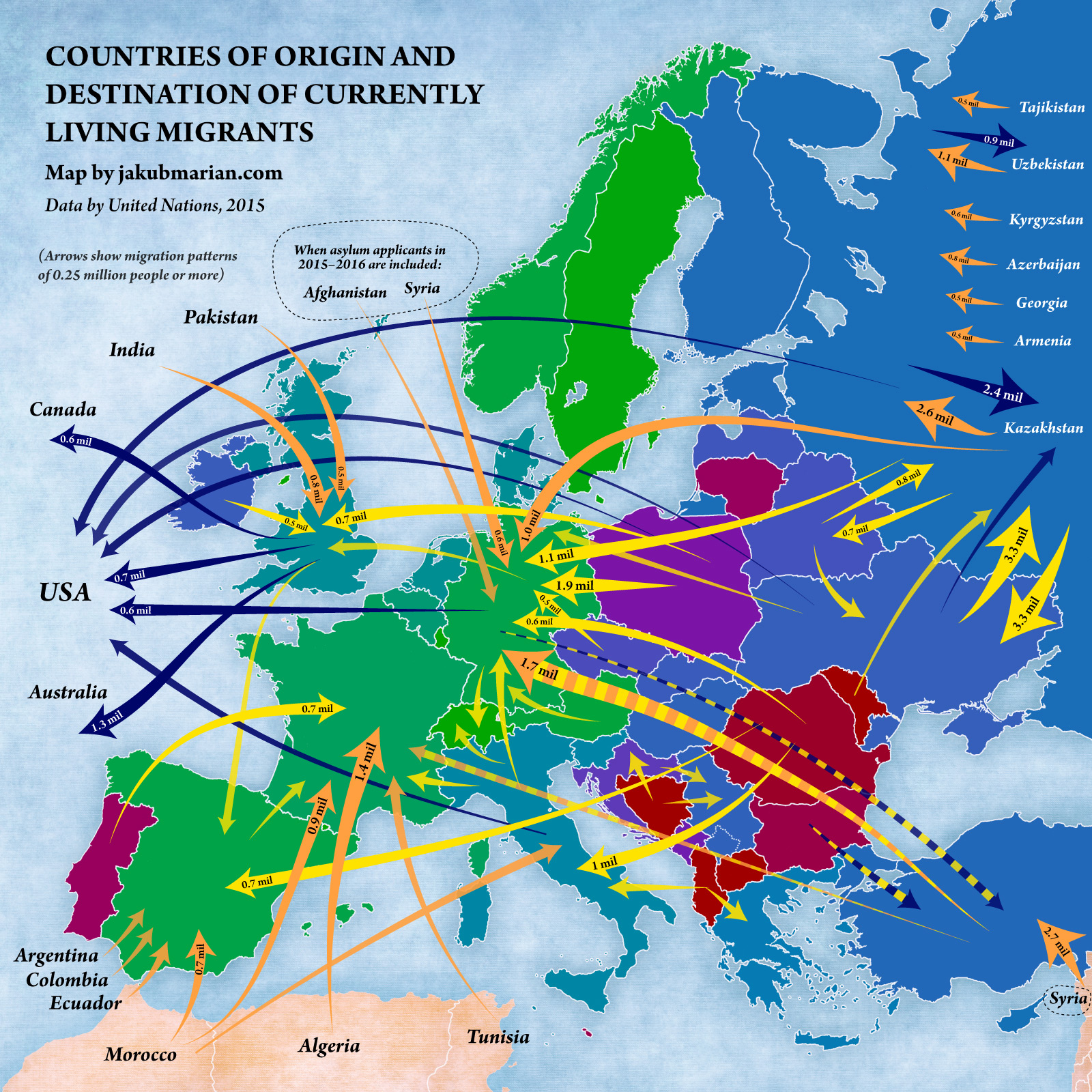
It should be noted that not all arrows represent entirely the same thing. Arrows pointing to former colonial powers often represent people “returning” to the country of origin of their ancestors. Most migrants from Kazakhstan to Germany are in fact ethnic Germans who emigrated from Kazakhstan after the fall of the USSR.
Similarly, emigrants from Bosnia and Herzegovina are mostly ethnic Croats and Serbs who left the country during the Yugoslav Wars.