Tip: Are you a non-native English speaker? I have just finished creating a
  Web App
The following two maps show how much European countries spent on their military in 2015, per capita and as a percentage of GDP. The maps are based on a database by SIPRI (Stockholm International Peace Research Institute). Note that I used my own population data, so there may be tiny differences between their per capita figures and mine.
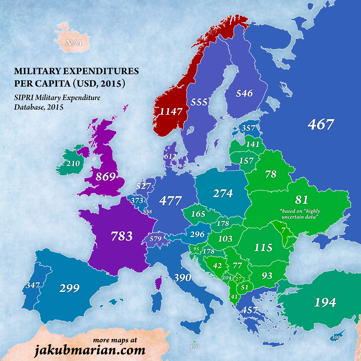
The following map shows the amount of money every person (including children) in a given country spent on the military (in the form of taxes) converted to USD at the market exchange rate, without taking purchasing power into account.
P.S. Before you get angry about Crimea having the same colour as Russia, please read this.
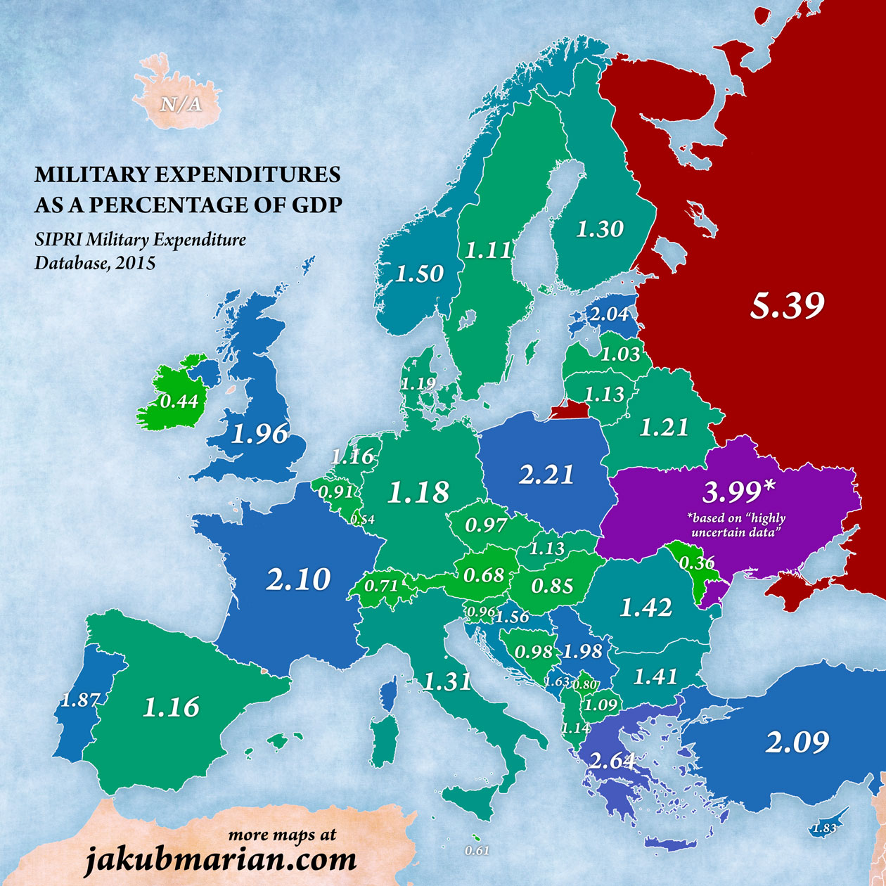
Of course, per capita spending itself is not necessarily indicative of how affordable the military is for the citizens, since it does not take the differences in economic power into account. When we show the same map, but now as a percentage of GDP, the picture looks significantly different.
For comparison, here are the corresponding figures for other major world military powers:
| Per Capita | % of GDP | |
| United States | $1854 | 3.3 |
| China | $156 | 1.9 |
| India | $40 | 2.3 |
| Japan | $323 | 1 |